Building components with StoryBook
May 19, 2019
What is
StoryBook is a playgroung for build UI components in isolation, can you describe the state you will need to this component and build it isolated of the main context. The next steps will show the first steps to use storybook, a bit more then “Hello World”.
Good to
- Build really reusable components;
- Test components;
- Catalog the components of your project (good for big teams);
- Less cascade development (tasks waiting something be done to begin).
Installing
Storybook can be used with many libraries like Angular, Ember, Vue, etc.. but now i will use for React.
Inside your project folder root:
npx -p @storybook/cli sb initStorybook will check your package.json to determine library are you using, to be sure of what kind will be installed, include type:
npx -p @storybook/cli sb init --type reactManutal installing:
npm install @storybook/react --save-dev
npm install react react-dom --save
npm install babel-loader @babel/core --save-dev
Add this to package.json
{
  "scripts": {
    "storybook": "start-storybook"
  }
}
After all, start Storybook:
npm run storybookWriting stories
If have you done the automatically installation, you can see the file storybook/config.js if not let’s create a config file containing:
import { configure } from '@storybook/react';

function loadStories() {
  require('../stories/index.js');
}

configure(loadStories, module);
Here is where we will call our stories, each story has a component, again, if you dont have the stories/index.js go to create:
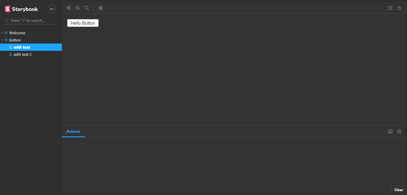
import React from 'react';
import { storiesOf } from '@storybook/react';
import { Button } from '@storybook/react/demo';

storiesOf('Button', module)
  .add('with text', () => (
    <Button>Hello Button</Button>
  ))
  .add('with text 2', () => (
    <Button>Hello Button 2</Button>
  ));
The storiesOf is the begining of the component, the .add() we use to add each state, this use two arguments, the name of state and the function with the return.
It’s everything you need to start building and testing your components with Storybook.
Theming
Personaly i prefer the dark theme in my editors and tools, Storybook has a dark theme to, at storybook/config.js import:
import { addParameters } from '@storybook/react';
import { themes } from '@storybook/theming';
and after add parameters:
addParameters({
  options: {
    theme: themes.dark,
  },
});
Now you should see something like:
Custom
You can edit the Storybook style to fit with your project, create a file myTheme.js and paste the code below:
import { create } from "@storybook/theming";

export default create({
  base: "dark",

  colorPrimary: "seagreen",
  colorSecondary: "#053219",

  // UI
  appBg: "#1e6f28",
  appContentBg: "#ede3e9",
  appBorderColor: "grey",
  appBorderRadius: 4,

  // Typography
  fontBase: '"Open Sans", sans-serif',
  fontCode: "monospace",

  // Text colors
  textColor: "white",
  textInverseColor: "rgba(255,255,255,0.9)",

  // Toolbar default and active colors
  barTextColor: "white",
  barSelectedColor: "white",
  barBg: "gray",

  // Form colors
  inputBg: "white",
  inputBorder: "silver",
  inputTextColor: "white",
  inputBorderRadius: 4,

  brandTitle: "My custom storybook them",
  brandUrl: "https://gianw.github.io/",
  brandImage: "https://placehold.it/350x150"
});
Now update config.js
import { configure } from '@storybook/react';
import { addParameters } from '@storybook/react';

import myTheme from "./myTheme";

addParameters({
  options: {
    theme: myTheme,
  },
});

that’s all for while.

Written by Gian Winckler who lives and works in Porto Alegre/BR building useful things.
github.com/GianW